Design Network Architects

Friday, February 29, 2008


Steel Prototype #1
Completed: 2005

This industrial prototype was designed with a long list of possible usages – from temporary site buildings to relief housing; from school classrooms to rural clinics. This is the result of a research and development project with a steel products manufacturer using their standard “off the shelf” items. The design formulates a modular system that can be adapted into various sizes and configuration. Its advantages include speed of construction using a range of factory standard steel purlins, struts and battens. Much of the architectural feature such as shade screens are built from off-the-shelf materials as well.


DNA was established in 2000, out of a partnership of four Kuching-based architects with the aim of setting up a research and design based practice.
DNA

Work Architecture Greenroof Wins PS1 Design Competitionby Jorge Chapa

Tuesday, February 19, 2008

Every year in New York City, the PS1 Contemporary Art Center hosts an architectural design competition to design a temporary, outdoor ’summer stage’ for the PS1 Warm-up Music Festival. While last year’s winning design was all about providing a space for dancing, this year’s temporary structure, designed by Work Architecture, is all about the green! And of course we love that here at Inhabitat…
For the past seven years, the PS1 gallery has invited a number of young emerging architects to participate in this competition to design a temporary structure for their summer music festival. The goal is to create a temporary space that is groundbeaking in terms of architecture, eye-catching, and has an innovative use of technology and production. Work Architecture, this year’s winner, meets all of those requirements in their stunning green design, as well as provoking an interesting dialog on the environment and the reuse of spaces.
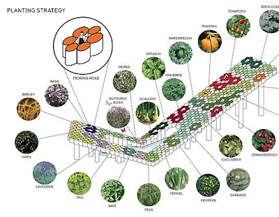
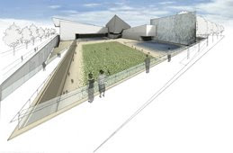
Work Architecture’s winning proposal calls for a series of cardboard tubes, each no more than a yard tall, being assembled next to each other to form a large platform. Some of those columns will be filled with a series of fruit-growing plants, everything from mint to peas, while some will remain completely open, from top to bottom, to allow some light to shine through. The platform will be held in a v-shape by a series of columns on the courtyard. The columns aren’t used only for structural purposes, some of them will contain everything from phone charging equipment to a swing. There will even be one in which fresh juice will be sold.

One cannot deny that the design is inspired. The idea was to reinvent the idea of a temporary space. Initial sketches showed the idea of an urban beach, an idea which was then turned upon its head. Rather than creating an artificial environment to suit a leisure space, they decided to refocus and latch on the idea of a leisure space that would fit an urban area. Rather than reference an old concept of leisure, the focus was now on how that leisure space could work for us, reinventing it for the city, and creating an area rich with excitement and experimentation. Thus, the urban farm concept for PS1 was born.
resource from Inhabitat

Introducing Work Architecture Company

http://www.work.ac/

TourBus Hotel

Saturday, February 16, 2008


TourBus Hotel, a prototype structure for the accommodation of the bus tour, situates itself at the junction of coming and going. What if the logistics of the bus tour and the complex social and visual mechanisms of the tour bus were the catalysts for a new building type? Acting as a speculative prototype, the TourBus Hotel plugs into the existing routes of European bus tours, located opportunistically on the highways between major tourist sites. Like an automotive service stop, the hotel is accessible from both directions of traffic, serving bus routes running in opposite directions simultaneously. The functions of the hotel are structured according to this directional split coming from Venice and going to Munich, for example, and vice versa.


WORLD TRADE CENTER MEMORIAL


WTC Site, New York,
NYLower Manhattan Development Corporation
Design CompetitionDesign: 2002205,000 sq. ft.


What if the very ground of the WTC site became the memorial? The entire surface of the site is organized according to a system of paving (each stone equal to the original proportions of the towers) which blends grass, stone, water, and light to create diverse spaces of gathering and remembrance. As these fields filter into one another they allow for the transition between personal reflection, collective memory, and urban events.


Education

Thursday, February 14, 2008

I read from the website about Master of Science in Architectural Conservation.
I ever think of proceeding into Conservation field after my first part in architecture.

I like heritage buildings, conservation projects , I think preserving something old is very good indeed before what we have now are all disappear in the future.

Serpentine Gallery overview

Tuesday, February 5, 2008


Serpentine Gallery is one of London’s best-loved galleries for modern and contemporary art. Its Exhibition, Architecture, Education and Public Programmes attract approximately 750,000 visitors a year and admission is free. In the grounds of the Gallery is a permanent work by artist and poet Ian Hamilton Finlay, dedicated to the Serpentine’s former Patron Diana, Princess of Wales. The work comprises eight benches, a tree-plaque, and a carved stone circle at the Gallery’s entrance.

Serpentine Gallery Pavilion 2000by Zaha Hadid
Zaha Hadid’s structure radically reinvented the accepted idea of a tent or a marquee. It took the form of a triangulated roof structure spanning an impressive internal space of 600sq metres by using a steel primarystructure. A folding form of angular flat planes extending to the ground gave an illusion of solidity while at the same time creating a variety of internal spaces.

Serpentine Gallery Pavilion 2001by Daniel Liebeskindwith Arup
With references to an origami figure, Eighteen Turns was a different kind of temporary structure. Highlighting the beauty of the Gardens and their connection to the Gallery, Eighteen Turns was created from sheer metallic planes assembled in a dynamic sequence. Clad in aluminium panels creating brilliant reflections of light, the structure revealed an entirely new perspective of the greenery of the park and the brick building of the Gallery. Eighteen Turns was a special place of discovery, intimacy and gathering.

Serpentine Gallery Pavilion 2002by Toyo Ito with Arup
The Serpentine Gallery Pavilion 2002 appeared to be an extremely complex random pattern that proved, upon careful examination, to derive from an algorithm of a cube that expanded as it rotated.The numerous triangles and trapezoids formed by this system of intersecting lines were clad to be either transparent or translucent, giving a sense of infinitely repeated motion.

Serpentine Gallery Pavilion 2003by Oscar Niemeyer
The Serpentine Gallery Pavilion 2003 was both simple and ingenious. Built in steel, aluminium, concrete and glass, its ruby-red ramp contrasted with the surprise of a partly submerged auditorium, affording views across the park. It also housed specially conceived wall drawings by Niemeyer. The Pavilion conformed to Niemeyer’s principle that every project must be capable of summary in a simple ‘sketch’ and that once the support structure is finished the architecture should be more or less complete.

Serpentine Gallery Pavilion 2005by Alvaro Siza and Eduardo Souto de Mourawith Cecil Balmond – Arup
In designing the Pavilion, Siza sought to ‘guarantee that the new building – while presenting a totally different architecture – established a “dialogue” with the Neo-classical house’.The result was a structure that mirrored the domestic scale of the Serpentine and articulated the landscape between the two buildings. The Pavilion was based on a simple rectangular grid, which was distorted to create a dynamic curvaceous form. It comprised interlocking timber beams, a material that accentuated the relationship between the Pavilion and surrounding Park.

Serpentine Gallery Pavilion 2006,by Rem Koolhaas and Cecil Balmond, with Arup
The Serpentine Pavilion 2006 was co-designed by Pritzker Prize-winning architect Rem Koolhaas and innovative structural designer Cecil Balmond. The centrepiece of the design was a spectacular ovoid-shaped inflatable canopy that floated above the Gallery’s lawn. Made from translucent material, the canopy was raised into the air or lowered to cover the amphitheatre below according to the weather. A frieze designed by Thomas Demand marked the first collaboration between an artist and the designers of the Pavilion. The walled enclosure below the canopy functioned both as a café and forum for televised and recorded public programmes including live talks and film screenings in the Time Out Park Nights at the Serpentine Gallery programme.

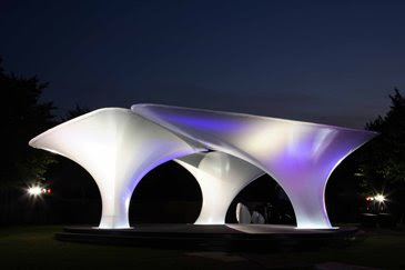
An installation by Zaha Hadid Architects 2007


The Serpentine Pavilion 2007

search for more details in Serpentine Gallery


V Houses at Verana


There are many ways to build employee quarters, temporary housing for those who decide to come work for a season at Verana. This summer we decided to build some additional housing and the images here show you what we came up with. V-houses at V-erana. An experiment which turned out to be exciting to design, to build and after all to live in.

The idea to build those ‘outlooks’ came from Jo Scheer who had build his ‘hoochs’ in Puerto Rico and Oregon. He used mainly Bamboo or Douglas fir poles; we decided to use metal instead. With basically no environmental impact or foot print, those structures can be built on any type of surface condition. Flat ground, steep hills, lots of vegetation, trees, water, sand or whatever else might be in the way for any other design or construction.

With 16’ off the ground they also created an instant spectacular view where there normally wouldn’t be one. Each room has a floor size of 16’x16’ but since all walls tilt outwards the actual space when standing is increased to 18’x18’ and by the time you look at the ceiling we are at 21’x21’.

For privacy reasons we spaced all ‘rooms’ about 18’ apart. Due to its modular basic principle any formation would be possible. Our V-houses were prefabricated in Puerto Vallarta and delivered by boat and carried up the hill. No machinery, no heavy duty equipment needed.

Building for Birds

Monday, February 4, 2008


In order to educate visitors on the past and present of the Calumet region's unique patchwork of industrial and natural areas this project re-conceptualizes the way the building is constructed. Like a 'nest', materials for the building are collected from things abundant, nearby, and discarded. The design is composed of salvaged steel from the Calumet industrial region and other discarded recyclable materials such as slag. In highlighting these materials, the building demonstrates the sustainable principle of re-use.


The south facing porch enclosed within a basketlike mesh of salvaged steel protects the migrating bird population from collisions with the glass that they cannot see. 97 million birds die annually in the U.S. from collisions with glass. At the same time it creates an outdoor classroom for visitors and becomes a blind for observing wildlife.


Geothermal heat pumps, earth tubes, a bio mass boiler, wind turbines, and water collection systems are integrated into the overall building design and become part of the educational component of the center and its site.


Architect: STUDIO GANG ARCHITECTS
Owner: City of Chicago Dept of Environment
Location: Calumet Illinois
Completion: Fall 2008


Building for Birds win the competition of fort Calument Environmental Center.

The worst Building in the history of Mankind


It's the Ryugyong Hotel in North Korea, where the world's 22nd largest skyscraper has been vacant for two decades and is likely to stay that way ... forever.

Even by Communist standards, the 3,000-room hotel is hideously ugly, a series of three gray 328-foot long concrete wings shaped into a steep pyramid. With 75 degree sides that rise to an apex of 1,083 feet, the Hotel of Doom (also known as the Phantom Hotel and the Phantom Pyramid) isn't the just the worst designed building in the world -- it's the worst-built building, too.

Read more

New Suzhou Museum by I.M.Pei


Founded in 1960 and originally located in the national historic landmark, Zhong Wang Fu palace complex, Suzhou Museum has been a highly-regarded regional museum with a number of significant Chinese cultural relics. A new museum designed by world famous architect I.M.Pei was completed in October 2006, covering over 10,700 square meter and located at the cross of Dongbei Street and Qimen Road.

This New Suzhou Museum is designed by I.M.Pei and is considered the last piece of architecture by him.

I.M.Pei likes Triangular shapes a lot and this building actually potray how creatively he combines the triangular shape to create both old and new ambiance for this museum.


I.M.Pei also incorporate natural lights into the his design and you can obviously view the contrast of dark and light area.


He also used the traditional Suzhou garden element to create a courtyard for the museum.
Suzhou Museum

United States Air Force Memorial


Arlington, Virginia
Completed 2006
Design Principal:James Ingo Freed
Senior Designer: John Neary

This memorial has been designed to honor aviation pioneers, celebrated and unsung, from the past, present and future alike. It is the first memorial ever dedicated to the Air Force in the nation's capital. Unlike the Navy, which has water as its medium and can be readily referenced with fountains, or the Army, which has land, the medium of the Air Force is air, invisible and difficult to articulate. The design challenge was the symbolic transition to making air palpable while simultaneously evoking the technological advances on which the Air Force depends. The essence of the project is flight. Inspiration was drawn from the contrails of the Air Force Thunderbirds as they peel back in a precision "bomb burst" maneuver. The memorial rises with three stainless steel spires "Soaring to Glory" asymmetrically at heights of 270', 231' and 201'. The appearance of the arcs changes dynamically with the viewer's location, the weather, the season, and the time of day. At night they are illuminated from the ground, with their tips more brilliantly lit for drama against, and from, the sky.

A visit to the Memorial involves a measured sequence of public and progressively more private experiences. Entering from a memorial gate, visitors turn onto the "Flight Line to Glory," a formal processional that unites key elements of the site physically, visually, emotionally. This ceremonial runway is intersected by an Air Force blue stone path which links a bronze Honor Guard at one end to the Chamber of Contemplation at the other: a freestanding outdoor room, without walls or roof, defined only by four translucent glass corners bearing inspirational texts. Inscription walls and a parade ground with stepped stone seating amplify the site. Thick rows of precisely shaped mature trees provide welcome shade as they screen parking and the temporary buildings.

Nagasaki National Peace Memorial Hall for the atomic bomb victims

Saturday, February 2, 2008


This building is designed by An Japanese Architect -Akira Kuryu and it won ARCASIA awards 2005/2006.
link