The high line by Diller Scofidio+ Renfro

Thursday, January 31, 2008


New York, NY - with Field Operations - to be completed 2008-9


The master plan for The High Line, an elevated railroad spur stretching 1.45 miles along Manhattan’s Westside, is inspired by the melancholic, unruly beauty of the ruin today where nature has reclaimed a once vital piece of urban infrastructure, The team retools this industrial conveyance into a postindustrial instrument of leisure reflection about the very categories of "nature" and "culture" in our time. By changing the rules of engagement between plant life and pedestrians, the strategy of agri-tecture combines organic and building materials into a blend of changing proportions that accommodate the wild, the cultivated, the intimate, and the hyper-social. The park is marked by slowness, distraction and an other-worldliness that preserves the character of The High Line

more at Diller scofidio +renfro

Quotes

“Architecture should allow people to think the unthinkable!” CEDRIC PRICE

Loblolly House-kieran Timberlake Associates

Monday, January 28, 2008


Loblolly House
Taylors Island, Maryland
Named for the tall pines that characterize its site on the Chesapeake Bay, this 2,200 square-foot single family residence seeks to deeply fuse the natural elements of this barrier island to architectural form. Positioned between a dense grove of loblolly pines and a lush foreground of saltmeadow cordgrass and the bay, the architecture is formed about and within the elements of trees, tall grasses, the sea, the horizon, the sky and the western sun that define the place of the house

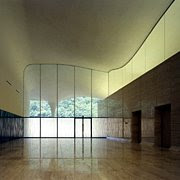
Crematorium In Kakamigahara

Friday, January 25, 2008


• work: Crematorium In Kakamigahara
• location : Kakamigahara, Gifu Prefecture
• architects : Toyo Ito & Associates, Architects

site area: 6,695.97m2
• building area : 2,269.66m2
• total floor area : 2,264.57m2
• structure : reinforced conctere, partly steel frame; 2 stories
• pricipal use: crematorium
• completion date : May, 2006

I trying to look into more info about this building, but cant find much about it.
Anyone who have the info can please share here...thanks

Antithesis to Toyo Ito Elements

Thursday, January 24, 2008


Tama Art New library shows an antithesis to Toyo Ito Elements.

The first floor features a gallery space where students will be able to assimilate the latest information from every angle. The gallery will act as a space for various exciting events and exhibitions.
On the second floor, there is space for reading where the stacks and reading seats are in perfect harmony. With its underground storerooms, the library can hold 300,000 volumes.


In the imaginative design of the new library, the entire first floor slopes gently, and arches allow the contours of the exterior garden to extend into the interior to create an exhilaratingly open space.


Cathedral of Christ the Light, Oakland, California

Wednesday, January 23, 2008

Comprised of a 1,500-seat sanctuary with side chapels, a baptistery and dependencies, the Cathedral will honor its religious and civic obligations to both the Catholic Diocese and the City.
With a building form based on an inner wooden vessel contained within a veil of glass—both of which are anchored on a sculptural concrete “Reliquary Wall”—the design conveys an inclusive statement of welcome and openness as the community’s symbolic soul.

Hierve-Diseñería - a modern building in Mexico City

Saturday, January 19, 2008

this building is a smalll apartment building, in mexico city which made of reinforced concrete, but what mades it so special is the use of 7,900 blown green glass spheres on the façade and inside the building.
They devised an ingenuous system of hanging the balls on rubber and steel cables from concrete juts on the building.


Municipal Library in Nembro, Italy by Archea Associati


Nembro is a small town near Bergamo, in Italy. In 2002, the municipality commissioned the well known Italian architects Archea Associati, based in Florence, to design their library. It was not an easy task, as they had to incorporate an end of 19th century c-shaped building (formerly a primary school) into the design.

The extension is situated in front of the opening of the c-shape, forming an open court with the old building.

The new wing could not be more different than the old structure. A transparent glass volume is surrounded by a façade of 40x40 cm red glazed earthenware tiles held in place by a frame of steel profiles, a construction method that enables the tiles to rotate and so act as a sunscreen for the glazed inner façades. The result is a distinctive 'screen' wall in which closed and open planes alternate in a continuous pattern created by the rotating ceramic elements.

The custom-made glazed terracotta tiles come from the ancient furnaces of the firm Sannini of Impruneta. The faces of the ’books’, weigh 13 kg each . Indirect sunlight is diffused inside, filtered as if through the slats of a Venetian blind so as never to fall directly on users of the library. The color of the tiles reminds one of the red marble of the area.

The building takes a whole different aspect at night: the light from within is diffused outside through the tiles, making the building seem lightweight and airy. as if dissolving into the evening sky.


Introduce: 2modern.blogs :

david Chipperfield -The Archive of Literature in Germany

Friday, January 18, 2008


The Archives are located in the German city of Marbach's scenic park, on top of a rock plateau overlooking the picturesque valley of the Neckar River.


The pavilion-like interiors of the building reveal themselves further as the visitor descends down through the display and archive spaces. Then he sees the dark timber-panelled exhibition galleries, illuminated only by artificial light due to the fragility and sensitivity of the works on display.

Maritime Museum by Tadao Ando

Water. Light. Simple. Modern. Serene. Tadao Ando
Tadao Ando is designing the Maritime Museum on Saadiyat Island, where Ando takes into consideration the nature, landscape and the maritime traditions of Abu Dhabi in developing this fluid, architectural volume
With it's reflective surface, the water court visually merges site and sea...the volume shaped by the force and fluidity of Abu Dhabi's winds." Housing an interior like that of a boat, with floating decks and ramps, visitors will be guided "through the exhibition space, echoing the theme of the museum and creating a dynamic gallery experience.

Dhows float over the voids of the interior space and help create an intense visual experience by relating objects to one another and to the museum architecture as a whole." The museum almost resembles a gate into the water from the island, an intentional move Ando was attempting to achieve by "defining a space of encounter between two important landscape elements of Abu Dhabi's culture."
Tando Ando is very famous in the way he manipulate the light and space.
His design is very interesting in term of the spaces and the relationship with the site.

AI Rostamani Headquarters (UAE)

Thursday, January 17, 2008


Year: 2007
Location: UAE
Typology: Office complex
Scale:
Status: proposal
Architect: MAD Ltd


According to one of my friend, this building looks like the Wolfbug Science Center. Very interesting design.

Ecoboulevard-Madrid, Spain

Wednesday, January 16, 2008

An urban intervention as delightful as it is functional.The increased interest in the way in which attitudes to nature can inform the architecture of the city is particularly evident in this unusually powerful combination of architecture, urbanism and landscape, which redefines not merely the way you think about this particular suburban extension, but about the nature of streets as a whole, particularly in extreme climates. The architect has installed ‘air trees’ along a new road which represents the anonymity of edge-of-town extensions while offering a constructive proposition about their future.
The idea is simple: residents can make choices about how they would like to ‘grow’ some aspect of environmental control or modification within the created light structures, that are ‘easily dismantled and energetically self-sufficient’. The notion is that these temporary mini-forests operate until such time as these areas are no longer reliant on air conditioning, at which point they can be disassembled, and left as ‘clearings’ in the urban forest (or jungle). Combining the idea of the tree, the container in which it might sit, solar power and the flow of air through a given structure creates a form of environmental nursery which nurtures growth, and provides a well-tempered environment which acts as a critique of the ‘bad planning’ which made such a proposition necessary in the first place.

This structure looks like one of my students works.
He is doing thoroughfare design, and he uses the concept of GREEN to create a structure in between two rows of shophouses
.